React Native
The same inputs and JSON forms for Expo apps on iOS and Android.
Requirements
- Expo SDK 58With Expo Router
- A src/ folderWith @/ mapped to src/
Install the core
- 1
Set up Uniwind
Start Metro once afterwards. Uniwind writes src/uniwind-types.d.ts, which types className.
Terminalnpx expo install uniwind tailwindcssTerminal// metro.config.jsconst { getDefaultConfig } = require("expo/metro-config")const { withUniwindConfig } = require("uniwind/metro") module.exports = withUniwindConfig(getDefaultConfig(__dirname), { cssEntryFile: "./src/global.css", dtsFile: "./src/uniwind-types.d.ts",}) - 2
Add the theme
Replace src/global.css. Colors switch with the system light or dark mode.
src/global.css@import "tailwindcss";@import "uniwind"; @theme { --font-sans: "Plus Jakarta Sans"; --font-mono: "JetBrains Mono"; --radius-xs: 4px; --radius-sm: 6px; --radius-md: 8px; --radius-lg: 10px; --radius-xl: 14px; --text-large-title: 34px; --text-large-title--line-height: 40px; --text-title: 22px; --text-title--line-height: 28px; --text-headline: 17px; --text-headline--line-height: 22px; --text-body: 17px; --text-body--line-height: 22px; --text-subhead: 15px; --text-subhead--line-height: 20px; --text-footnote: 13px; --text-footnote--line-height: 18px; --text-caption: 12px; --text-caption--line-height: 16px;} @layer theme { :root { @variant light { --color-background: oklch(0.995 0.002 270); --color-foreground: oklch(0.17 0.02 275); --color-card: oklch(1 0 0); --color-card-foreground: oklch(0.17 0.02 275); --color-popover: oklch(1 0 0); --color-popover-foreground: oklch(0.17 0.02 275); --color-primary: oklch(0.511 0.23 277); --color-primary-foreground: oklch(0.985 0.01 275); --color-secondary: oklch(0.962 0.018 275); --color-secondary-foreground: oklch(0.4 0.18 277); --color-muted: oklch(0.966 0.005 270); --color-muted-foreground: oklch(0.52 0.02 270); --color-accent: oklch(0.955 0.02 275); --color-accent-foreground: oklch(0.36 0.16 277); --color-destructive: oklch(0.577 0.245 27.325); --color-success: oklch(0.6 0.15 155); --color-border: oklch(0.92 0.008 270); --color-input: oklch(0.9 0.01 270); --color-ring: oklch(0.585 0.233 277); } @variant dark { --color-background: oklch(0.16 0.012 275); --color-foreground: oklch(0.97 0.005 275); --color-card: oklch(0.205 0.014 275); --color-card-foreground: oklch(0.97 0.005 275); --color-popover: oklch(0.205 0.014 275); --color-popover-foreground: oklch(0.97 0.005 275); --color-primary: oklch(0.673 0.182 277); --color-primary-foreground: oklch(0.17 0.04 277); --color-secondary: oklch(0.27 0.05 277); --color-secondary-foreground: oklch(0.87 0.065 275); --color-muted: oklch(0.25 0.012 275); --color-muted-foreground: oklch(0.71 0.018 275); --color-accent: oklch(0.28 0.055 277); --color-accent-foreground: oklch(0.88 0.06 275); --color-destructive: oklch(0.704 0.191 22.216); --color-success: oklch(0.72 0.15 155); --color-border: oklch(1 0 0 / 10%); --color-input: oklch(1 0 0 / 15%); --color-ring: oklch(0.585 0.233 277); } }} - 3
Add components.json
At the project root, so the shadcn CLI knows where files go.
components.json{ "$schema": "https://ui.shadcn.com/schema.json", "style": "new-york", "rsc": false, "tsx": true, "tailwind": { "config": "", "css": "src/global.css", "baseColor": "neutral", "cssVariables": true }, "aliases": { "components": "@/components", "utils": "@/utils/cn", "lib": "@/lib", "hooks": "@/hooks" }} - 4
Add the packages
expo install picks versions for your SDK.
Terminalnpx expo install @tanstack/react-form zod libphonenumber-js date-fns @zxcvbn-ts/core @zxcvbn-ts/language-common @zxcvbn-ts/language-en lucide-react-native react-native-svg @gorhom/bottom-sheet react-native-gesture-handler react-native-reanimated react-native-keyboard-controller react-native-safe-area-context tailwind-merge @formatjs/intl-getcanonicallocales @formatjs/intl-locale @formatjs/intl-displaynames @formatjs/intl-listformat react-native-url-polyfill - 5
Add the core
Form, sheets, rows and the schema helpers.
bunx --bun shadcn@latest add https://fieldkit.muturi.dev/r/native/form.json - 6
Load the polyfills
Before Expo Router starts.
Terminal// index.ts, then set "main": "index.ts" in package.jsonimport "@/polyfills"import "expo-router/entry" - 7
Wrap the app
Terminal// src/app/_layout.tsximport "@/global.css" import { BottomSheetModalProvider } from "@gorhom/bottom-sheet"import { Stack } from "expo-router"import { GestureHandlerRootView } from "react-native-gesture-handler"import { KeyboardProvider } from "react-native-keyboard-controller" import { ToastProvider } from "@/components/fieldkit/toast" export default function RootLayout() { return ( <GestureHandlerRootView style={{ flex: 1 }}> <KeyboardProvider> <BottomSheetModalProvider> <ToastProvider> <Stack /> </ToastProvider> </BottomSheetModalProvider> </KeyboardProvider> </GestureHandlerRootView> )}
Add inputs
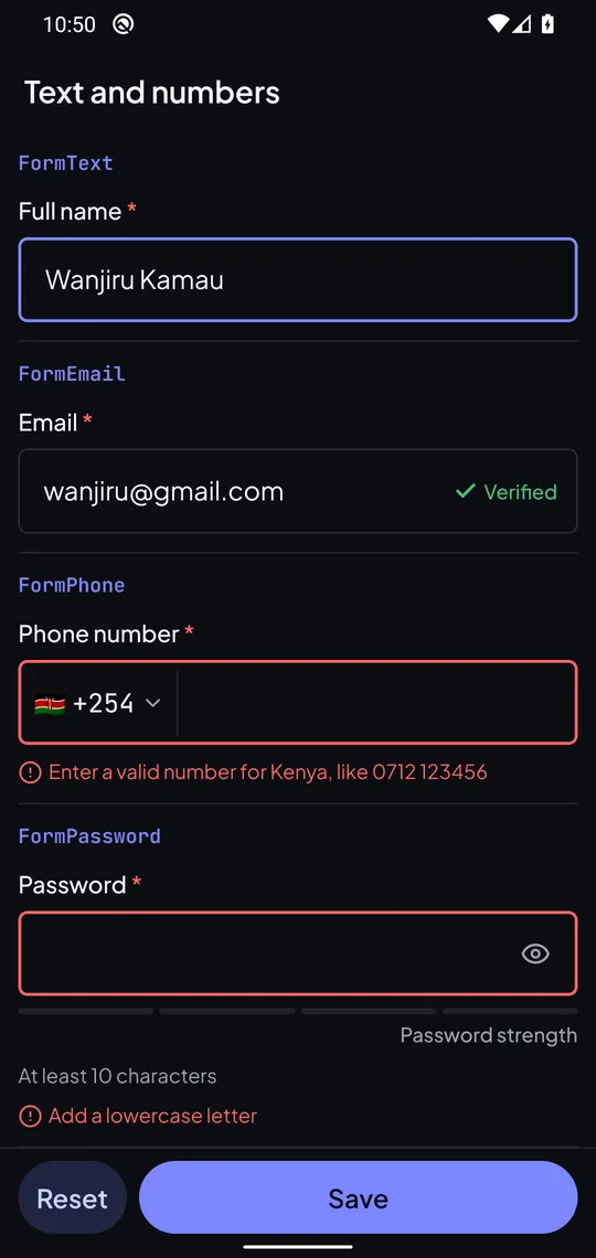
Props and schema rules match the web inputs.
bunx --bun shadcn@latest add https://fieldkit.muturi.dev/r/native/form-email.json https://fieldkit.muturi.dev/r/native/form-phone.json- FormTextr/native/form-text.json
- FormEmailr/native/form-email.json
- FormPhoner/native/form-phone.json
- FormPasswordr/native/form-password.json
- FormUrlr/native/form-url.json
- FormTextarear/native/form-textarea.json
- FormRichTextr/native/form-rich-text.json
- FormNumberr/native/form-number.json
- FormSliderr/native/form-slider.json
- FormDater/native/form-date.json
- FormDateTimer/native/form-date-time.json
- FormDateRanger/native/form-date-range.json
- FormSelectr/native/form-select.json
- FormCountryr/native/form-country.json
- FormMultiSelectr/native/form-multi-select.json
- FormComboboxr/native/form-combobox.json
- FormRadioGroupr/native/form-radio-group.json
- FormCheckboxGroupr/native/form-checkbox-group.json
- FormCheckboxr/native/form-checkbox.json
- FormSwitchr/native/form-switch.json
- FormOtpr/native/form-otp.json
- FormFiler/native/form-file.json
- FormRatingr/native/form-rating.json
Usage
newsletter-form.tsx
import { z } from "zod"
import { Form } from "@/components/form/form"import { FormEmail } from "@/components/form/form-email"import { FormSubmit } from "@/components/form/form-submit"import { emailField } from "@/lib/field-schemas"
const schema = z.object({ email: emailField() })
export function NewsletterForm() {  return (    <Form schema={schema} defaultValues={{ email: "" }} onSubmit={save}>      <FormEmail name="email" />      <FormSubmit>Subscribe</FormSubmit>    </Form>  )}
JSON forms
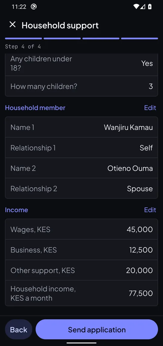
Steps, show if, repeat sections and sum of, from the same spec as the web.
bunx --bun shadcn@latest add https://fieldkit.muturi.dev/r/native/json-form.jsonhousehold.tsx
import { JsonForm } from "@/components/form/json-form"
export function Household() {  return <JsonForm spec={householdSpec} review guard onSubmit={send} />}
What changes on mobile
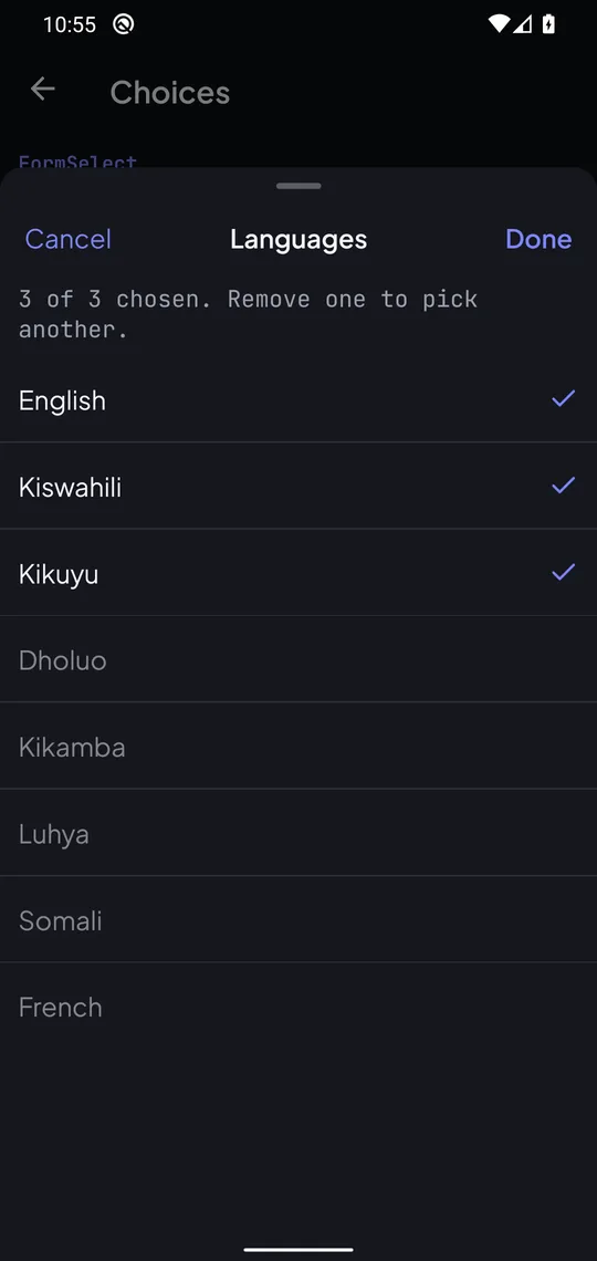
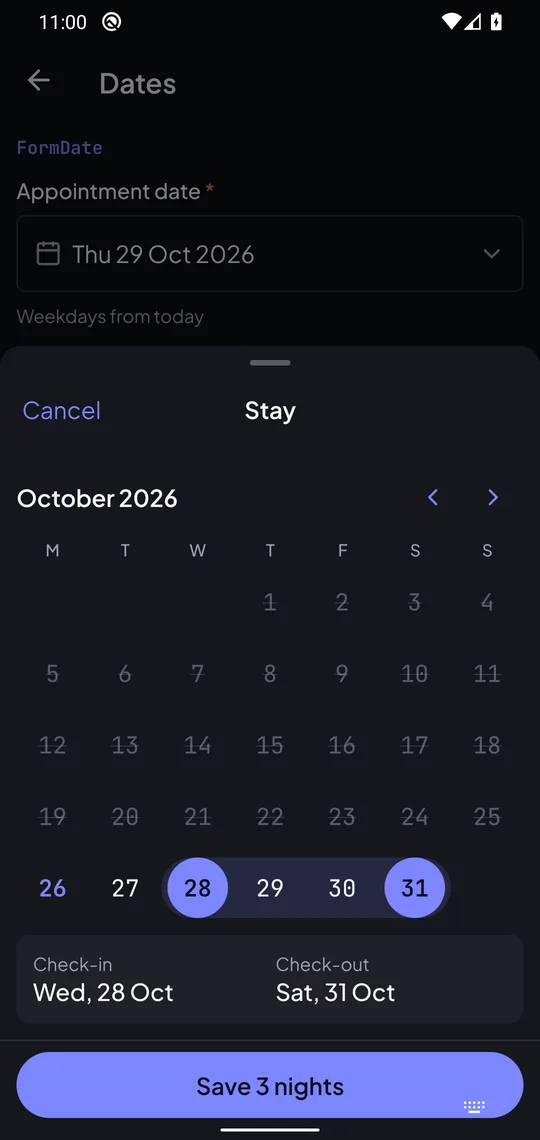
- Lists, dates and file sources open in bottom sheets, not popovers.
- Inputs set the keyboard, autofill and Next key, and the field moves into view above the keyboard.
- FormFile picks from the camera, photos or files. Use nativeFileField in place of fileField.
- FormLeaveGuard asks in a sheet when the user goes back with unsaved changes.
- Submit checks every field first, even while the keyboard is open.